
Work No 553; Primary Contrary – the Conning of the Consumer. c. Michael St.Mark 2011
__Context_____________________________________________________________________________________________
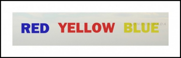
Taking the generally accepted artists’ primary colours of red, yellow and blue, this seminal work intends basic dichotomy visual/literal contradiction and confusion in the viewer, regressing him back to first intellectual learning, disassembling the mental link between experience and language that is used in politics and the advertising media to manipulate individual choice. The work intends an awakening to a conscious therefore powerful awareness of the strong hold of an utter falseshood over us.
The first use of this particular text/colour contradiction psychology in art or graphic design.
( *Update Sept 2013, now in widespread use worldwide.)
___Data____________________________________________________________________________________________________
Stencilled acrylic on artists’ board, 40″ x 15″
One worldwide
£5850 ( unframed)